unVerse, not coming to iPhone and iPad

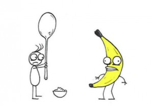
image from LF favourite “Rejected“
All three of us here at Lucky Frame are first and foremost artists. We each come from different artistic backgrounds (design, music, printmaking) but we prioritize creation, meaning, and experience above all else.
We also like fun and beautiful things. That’s why when we saw Ian Snyder’s unVerse, a Flash-based music generation system, we got in touch with him right away.
Ian makes some really amazing art and games (check out Star Swing for a really interesting and pretty one-button game), and unVerse is a super beautiful little generative music system. It uses a minimalist system of white points floating on a black screen. When two points approach they will connect and push each other away, generating a musical tone. Dragging your finger across the screen pushes the points, creating stunning patterns reminiscent of shooting stars.
When we played with his Flash version we quickly realized that it would work really well on iPad/iPhone, since clicking and dragging is a bit clunky but glass screens are really quite conducive to gliding your finger. We contacted Ian about making an iOS version, and he very graciously agreed.
So in our spare time (well, Jon’s spare time) we made a pretty little app version of unVerse. We eventually submitted it to the iTunes store and we were very excited to release it to the world. And then Apple rejected it.

Yes, that’s right, we were rejected on the grounds that unVerse is “not very useful”. Hmm. Strangely, an app that plays a sound of an airplane appears to have more use than our generative music system. Anyway.
To continue with my narrative, I decided to respond to our rejection:
Hello,
We strongly believe that our app unVerse provides significant entertainment and artistic value. It is a beautiful application of a complex generative system, offering an accessible way to explore procedural music creation. Far more than a simple soundmaker, it fits in with our company philosophy by introducing powerful musical concepts through an aesthetically interesting and understandable interface.
unVerse looks beautiful, sounds beautiful, and is fun to use and play with. That makes it a worthwhile app to have on the store.
Thank you,
Yann Seznec
Director, Lucky Frame
Their response was rather unhelpful.
Hello,
Thank you for the feedback. However, it would be appropriate to incorporate additional features and functionality to resolve this issue. If you wish to appeal your review, you can submit a request to the App Review Board.
I took them up on their offer, and submitted a request to the App Review Board. A few days later I got a call from an Apple representative in California. I should say at this point that the representative was very nice and respectful throughout the conversation, and I enjoyed speaking to them.
In a nutshell, they told me, the app needed more ‘features’. “I love this app, I really do,” they said, “it’s beautiful. It just needs…more.” They explained that this could take any number of different forms – different sounds, different colors, different movements, anything. It just needed more.
This is infuriating. There seemed to be no comprehension of the inherent contradiction between “this is great” and “but it needs more”. The whole reason unVerse is great is precisely because it does so little. It is a study, a little glimpse into a musical and physical interaction. If the app had more options and things to change, it would artistically break down and lose its way. “Oh Mondrian, your paintings are great, but they could just use a couple of curves”.
This line of reasoning is essentially “if it’s not right, add something”. This really goes against any design philosophy that Apple has, not to mention standard design or user experience practice.
While other developers (I strongly dislike using that word, but that’s a different story) might go ahead and add some extra features and re-submit, we have chosen not to do so. It is against our artistic and creative philosophy to arbitrarily add features, and it would not make sense from a company standpoint to invest more time in an app that could very well be rejected once again for not conforming to some random reviewer’s idea of what constitutes “useful”.
Instead, we can offer this video (and this website) that shows what could have been.
We have also made the source available to all, if you want to have a play around.
As a post-script, I should add that I don’t mean this to be a giant condemnation of the App Store, or Apple, or anything like that. Without the App Store we would not even be in a position to complain about how we can’t distribute one app to millions of users worldwide – our previous apps have been installed on thousands of devices, and of course that is absolutely amazing. My criticism in this case is more to do with how we evaluate creative output, and it’s a problem that could be applied to any number of situations, from apps to music interfaces. An unfortunate byproduct of consumer-focused digital media is that perhaps more than ever it prioritises adding “stuff” rather than trying to really explore and experiment with specific interactions, reactions, and interfaces.

